• Points are back! Read about it HERE


    current issues

    1 - NEW PLAYERS - Players who created an account on or after Oct 15 2023 are not able to log into the forum
    2 - AWOL - We do not have an AWOL button under the ACTIVE tab yet. Please check each game to see if you are AWOL.
    3 - STUCK GAMES - Some games will not load properly. If you encounter this, please post stuck games HERE

    Thanks.

  • Welcome to Major Command's RISK Game forum.

    If you are a registered player, please log in:

    LOG IN

    If you are new to Major Command and would like to
    play our RISK game online. Then please sign up here:

    SIGN UP

Reserves

zspBANNED

Well-known member
Awesome Player
Joined
Sep 28, 2010
Messages
853
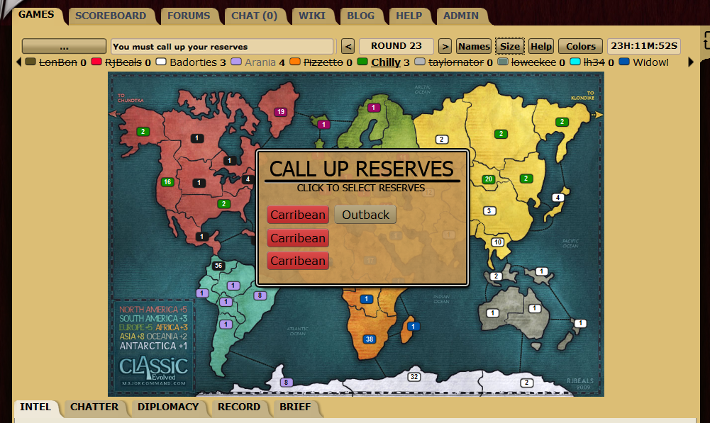
The placement of the reserves needs to change. Many new players can't find where you call up reserves (going into the intel tab, selecting the 3 cards and clicking the button to call them up). So I propose they be moved right underneath the map so they are easily visible.

reservesJPG.jpg
 

landmine

Well-known member
Awesome Player
Joined
Sep 27, 2010
Messages
121
why not automatically after you have click on the set
 

landmine

Well-known member
Awesome Player
Joined
Sep 27, 2010
Messages
121
you : "(going into the intel tab, selecting the 3 cards and clicking the button to call them up)"

i say : going into the intel tab, selecting the 3 cards and you get them automatickly without clicking the button to call them up.
 

zspBANNED

Well-known member
Awesome Player
Joined
Sep 28, 2010
Messages
853
lol landmine, please reread my proposal...summary: I'm saying, the reserves need to be moved from the intel tab to right under the map so a new player doesnt need to go searching for them. Look at the image I included and notice where the reserves are as opposed to where they normally are.

To reply to your little proposal, I say no. Say if I had a red, red, red, white, tan cards. So there are two sets of reserves that I could call up, either the [red, red, red] or [red, white, tan]. You might click the 3 red reserves, but then realize you'd rather the multi-colored set b/c two of those cards are bold (meaning +2 armies on that particular region). You haven't clicked to call them up so you can change them.

Or..say you have 3 reserves and you happen to have a set. You almost call them up but then decide to hold onto your cards. If they are automatically called up, that could ruin a game.

Anyway, what you are proposing is completely unrelated to what I am proposing. Start your own dang thread! :p
 

landmine

Well-known member
Awesome Player
Joined
Sep 27, 2010
Messages
121
youre right man
again mine mistake youre the boss
this forum is yourse and you will not see anything of me again
 

Kjell

Well-known member
Awesome Player
Joined
Nov 29, 2010
Messages
143
I think it could help, when I played with some friends they were unaware that they had reserves (we were all in the chat tab I guess). Also I think the call reserves button should be to the left or closer from the right or something to make it more clear that such a button even exists.
 

zspBANNED

Well-known member
Awesome Player
Joined
Sep 28, 2010
Messages
853
haha oh landmine...you are an interesting fellow. You seemingly misread my proposal, so I explained yet again, what I meant. You seem to have the mindset that everyone should always agree with your suggestions. Proposing 2 totally different suggestions in one thread is not how it is done, champ. Simple as that.

But always remember...


...


...


I'm the boss.
 
Last edited:

zspBANNED

Well-known member
Awesome Player
Joined
Sep 28, 2010
Messages
853
I even did a measurement to make sure there would be enough room for the max # of cards (9) and there would be. Even if there wouldn't be, just start a new line of cards directly underneath the top line.
 

VetaBANNED

Well-known member
Awesome Player
Joined
Dec 2, 2010
Messages
59
this wouldnt really solve the real issue, which is understanding HOW to turn in cards. I figured it out but when I started it wasn't exactly intuitive that I needed to click the cards (in fact I didn't even realize they were clickable).
 

zspBANNED

Well-known member
Awesome Player
Joined
Sep 28, 2010
Messages
853
This is true. Many newbies don't know which reserves to call up too. Maybe have them flash when there's a set of reserves available to be called up? And if there's 2 possible sets, have them flash alternatively?

You're right that my proposal doesn't solve that issue, but that's not the issue that I was trying to resolve. FINDING the reserves is half the battle.
 

zspBANNED

Well-known member
Awesome Player
Joined
Sep 28, 2010
Messages
853
Check out the chatter here. Once again, a new player doesn't know where the reserves are. This chatter is a good read to see what a newbie needs help with.
 

Incandenza

Minister of Propaganda
O.G.
Awesome Player
Joined
Jul 27, 2009
Messages
2,302
While it's indeed possible that the reserves could be made a bit more apparent, I'd say that new players are going to end up learning by doing, especially, when in the case of the last game you linked to, they never actually read any of the instructions to begin with. Hell, even if they really study the wiki, expecting someone to get every last nuance of the game from the word go is an unrealistic as for any other moderately complex game...
 

zspBANNED

Well-known member
Awesome Player
Joined
Sep 28, 2010
Messages
853
I'd agree with that, but to make this site as user-friendly as possible so that new players don't have to read the wiki at all would obviously be best for retaining new players. I see no reason why the reserves need to be hidden away in one of the tabs down there anyway. You don't really need any of the information that is provided in any of the tabs to play, but the reserves are actually a part of the game...I'd say they need to be a bit more obvious as to where they even are...
 

Incandenza

Minister of Propaganda
O.G.
Awesome Player
Joined
Jul 27, 2009
Messages
2,302
I'd agree with that, but to make this site as user-friendly as possible so that new players don't have to read the wiki at all would obviously be best for retaining new players. I see no reason why the reserves need to be hidden away in one of the tabs down there anyway. You don't really need any of the information that is provided in any of the tabs to play, but the reserves are actually a part of the game...I'd say they need to be a bit more obvious as to where they even are...

That's a fair point, tho I'd say that you need info in all the tabs to play at all effectively. But I'm kind of skint as to how to make reserves more prominent without A) making them do something annoying (blinking, for instance, would be radioactively annoying for anyone but the rawest noob) or B) taking them out of the tabs altogether and putting them on some other part of the screen (i.e. the top bar, which IMHO wouldn't make them all that much more visible since they'll be jostling for eye-catching-ness with all the other info up there).
 

zspBANNED

Well-known member
Awesome Player
Joined
Sep 28, 2010
Messages
853
That's a fair point, tho I'd say that you need info in all the tabs to play at all effectively.
Definitely agree with that, but I'm just talking about the interface aspect of it, actually knowing HOW to do things.

But I'm kind of skint as to how to make reserves more prominent without A) making them do something annoying (blinking, for instance, would be radioactively annoying for anyone but the rawest noob)
This was my idea at first for those who have won half the battle by actually FINDING where they are. But yeah, the blinking would be quite annoying. Maybe have them encircled by a thick black outline? And if you have 2 sets in 5 cards (red, red, red, white, tan) have the 3 reds outlined by the black, and then have the other set outlined with red? The colors obviously can be changed. So in this case, obviously one of the red cards will have 2 outlines around the reserve. But this isn't what I am proposing.

or B) taking them out of the tabs altogether and putting them on some other part of the screen (i.e. the top bar, which IMHO wouldn't make them all that much more visible since they'll be jostling for eye-catching-ness with all the other info up there).
Which is why I recommended putting them on the bottom of the map and not the top :) Look at the picture I posted in the first post of this thread. I think it would work there nicely.
 

WidowMakers

Senior Cartographer
O.G.
Awesome Player
AADOMM
M.C. Play Testers
Joined
Jan 11, 2010
Messages
2,348
I think that the reserves coudl stay where they are but once a player gets a chance to turn in, a popup needs to show on teh screen (similar to teh size of the deploy dialog)

Then once a player has reserves they can trun in, once they begin the turn, a box pops up and asks them if they want to trun in.
They can Click and move on.

Like this??
2b0e036f59787a2a1daab171872237e2.png
 

VetaBANNED

Well-known member
Awesome Player
Joined
Dec 2, 2010
Messages
59
WidowMakers that looks greats and seems like a pretty reasonable suggestion. I think that would work perfectly (taking it a little further, perhaps even a help ? on the bottom that when clicked says that you need 1 of each color or 3 of a kind, as well as something noting that you get extra troops for controlling the territory)
 

zspBANNED

Well-known member
Awesome Player
Joined
Sep 28, 2010
Messages
853
That's perfect, Widz. There should obviously be a "Later" option or something if you don't want to call up your reserves yet.
 

WidowMakers

Senior Cartographer
O.G.
Awesome Player
AADOMM
M.C. Play Testers
Joined
Jan 11, 2010
Messages
2,348
That's perfect, Widz. There should obviously be a "Later" option or something if you don't want to call up your reserves yet.

Correct. I just photoshopped it up in 10 minutes. The would need to be buttons, help and dialog to explain what is happening. Along with current reserve rates and bonuses.
 
Top