• Scoreboard and Points Live. Read about it HERE

    current issues

    1 - NEW PLAYERS - Players who created an account on or after Oct 15 2023 are not able to log into the forum
    2 - AWOL - We do not have an AWOL button under the ACTIVE tab yet. Please check each game to see if you are AWOL.

    Thanks.

  • Welcome to Major Command's RISK Game forum.

    If you are a registered player, please log in:

    LOG IN

    If you are new to Major Command and would like to
    play our RISK game online. Then please sign up here:

    SIGN UP

Feedback Requested - Hip Hop Map

RjBeals

Map Commander
O.G.
Awesome Player
AADOMM
Joined
Jul 25, 2009
Messages
1,866
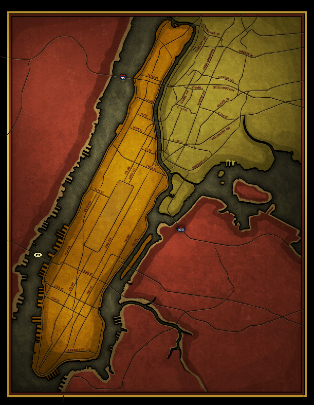
Looking for a bit of feedback. In case you don't know, I'm involved with a mapping contest themed with mapping New York. I chose to showcase the birth of Hip Hop. As usual, I didn't have a concrete theme in my head. As my map evolved, it sort of ended up like the attachment. The bottom right will be reserved for a subway/DJ and a big blurb of text explaining the map.

But... my wife thinks this new theme, which she calls graphic novel / comic booky / playbill, does not make sense. She thinks it looks like the playbill of a comedy play - especially the title.

I on the other hand sort of like it.

So, ignoring the bottom right, do you all think I've missed the mark with this? Or do you think it's come together nicely. Thanks all.

10-12-NY_RJBeals.jpg


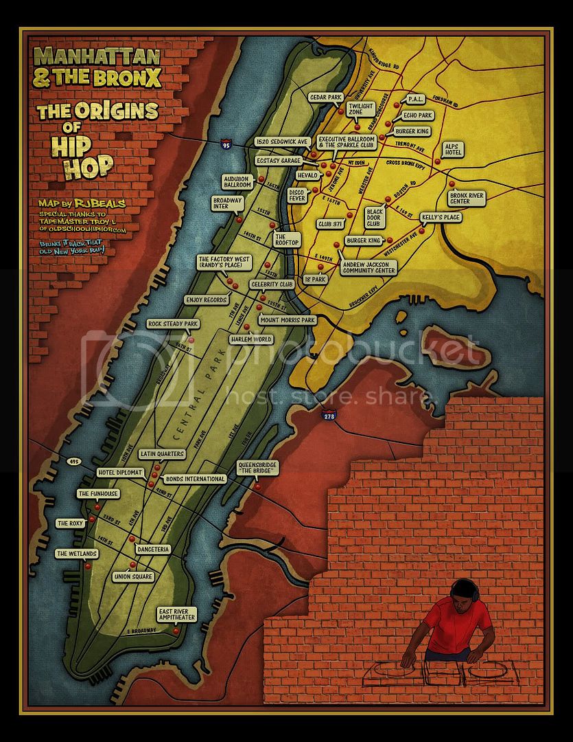
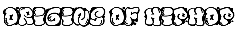
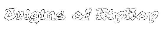
(edit) there's tons of "graffiti fonts" out there, but I didn't like any that I tried. I agree the bubble title letters do not necessarily look like spray paint - but it looks close. And the Old rappers I spraypaint on the subway (not there yet) will be in the traditional graffiti fonts.
 
Last edited:

ghost

Chief Ambassador
Awesome Player
Joined
May 23, 2010
Messages
1,525
to me.. it's your color scheme.. it doesn't really work for me.
a good site to look for colors that work/palettes is colourlovers.com..
try mixing it up a bit.. if you don't find anything you think works better, stick with this..
i don't think it looks like a comedy show playbill.. but i do think, messing with the sizes of text like that all in
one area is too much.. is it possible to move the text around some? to me, that would pull it together more.
the font is 'ok'.. try dafont and type in some of the text.. see what works for you. :)

it's cool though.. i am really digging the map itself all the details and elements.. very awesome.
can't wait to see it when you're done with it.
 

ORBOTRON

Moderator
O.G.
Awesome Player
Joined
Sep 23, 2010
Messages
2,476
I love the map, but the fonts def give me the wrong feel. You need something gritty and badass. Something off an old school rap album cover
 

andyokc

Member
Awesome Player
Joined
Aug 17, 2010
Messages
14
Overall, I like it. I agree with ghost re: the color scheme. Something more urban/industrial (black & gray, concrete, etc.) might work w/ the primary set (especially red & yellow). And some graffiti font is probably a necessity, so i think it'll look better when it's got the subway scene in the bottom right.
 
Last edited:

RjBeals

Map Commander
O.G.
Awesome Player
AADOMM
Joined
Jul 25, 2009
Messages
1,866
thanks guys - how but something along these lines?

079818caa08ed4934089f599a7fb3f2a.png
 

RjBeals

Map Commander
O.G.
Awesome Player
AADOMM
Joined
Jul 25, 2009
Messages
1,866
I might try to lighten it up a bit. It's really dark at the moment. Thanks Ghost. Now I wish your man would drop me some feedback.
 

Badorties

Boss General (Retired on a Desert Island)
O.G.
Awesome Player
Gentlemen of Leisure
AADOMM
M.C. Play Testers
The Embassy
The Wiki Bar
Joined
Jul 25, 2009
Messages
6,398
I think the title treatment does look like a playbill. but I can't say why. either way its not very well composed, the text that is. the type is a bit too light hearted i think, especially when you combine it with a word like Hip hop, which has to safeguard against lightheared associations. There are tons of graf fonts out there, i've used many while making concert posters from hiphop folks.. it's just about finding the right one. sometimes combining ot tweaking them.

fd87d98c0f245985c866a08384f9a5ee.png

673d5c7566141ed4cd87f0f8d0c76c62.png

ac3b2f0ed52c5fe9c13e72253d79f6dc.png

99e9d90f710d469e18debae50764277f.png


I like the new colors too.
 

ghost

Chief Ambassador
Awesome Player
Joined
May 23, 2010
Messages
1,525
i personally dig the last text treatment Bado suggested.. it screams "hop hip"... lol. :p
 

asunder

Well-known member
Awesome Player
Joined
Jun 11, 2010
Messages
185
i know ghost mentioned colourlovers for pallet inspiration, i also use http://kuler.adobe.com/

its great for browsing through, or brainstorming to create your own combination :)
 

acaminante

Well-known member
Awesome Player
Joined
Aug 4, 2010
Messages
65
was burger king really that influential in the origins of hip hop?
 

Badorties

Boss General (Retired on a Desert Island)
O.G.
Awesome Player
Gentlemen of Leisure
AADOMM
M.C. Play Testers
The Embassy
The Wiki Bar
Joined
Jul 25, 2009
Messages
6,398

RjBeals

Map Commander
O.G.
Awesome Player
AADOMM
Joined
Jul 25, 2009
Messages
1,866
Believe it or not, BK was a gathering place after it closed. They would move tables, set up the DJ booth and have parties. I thought it was strange also, but it's been verified by old schoolers and a book. The 2 listed in the map were landmark sites for hip hop :)
 

acaminante

Well-known member
Awesome Player
Joined
Aug 4, 2010
Messages
65
Believe it or not, BK was a gathering place after it closed. They would move tables, set up the DJ booth and have parties. I thought it was strange also, but it's been verified by old schoolers and a book. The 2 listed in the map were landmark sites for hip hop :)

There goes, RJBeals... droppin' some hiphop knowledge.

I think the map looks great - don't change the colors. I agree that the font is off, but for me it is not so much the font as the brick wall behind it. I don't like the bricks as is - instead of laying on top of Queens / NJ, maybe they would look better as a texture coming through instead? Perhaps give all the land masses a "concrete" texture, and where you have the bricks now it just becomes more pronounced or turns into bricks, but the map itself looks like bricks rather than having a layer of bricks on top. Right now it is an element that doesn't jive with the rest of the map for me.

Have a writer sketch the title for you, scan it and color it. Drop "manhattan and bronx", just have a "Origins of Hip Hop" in a cool style using the green, yellow and blue. Maybe move it to Queens instead of NJ.

Problem with most graff fonts is readability. I like the font on this page's title - readable but not overdoing it: http://grove.ufl.edu/~hhc/
 

RjBeals

Map Commander
O.G.
Awesome Player
AADOMM
Joined
Jul 25, 2009
Messages
1,866
Dude.. seriously repped for that post.
 
Top